This map shows where your food really comes from – and it might surprise you
You are what you eat. And yet most of us have very little idea of what it is we’re putting in our bodies. Take the 2013 scandal that revealed processed beef products in Europe had been contaminated with horsemeat. The discovery sent shockwaves throughout the food industry and left consumer confidence at rock bottom.
It also exposed just how complex and global our food supply chains have become. But according to a new study that tracks the origin of our food products, this isn’t a recent development.
In fact, we’ve been exchanging food crops for so long that today, almost 70% of crops that form the basis of a national diet (think tomatoes in Italy, potatoes in Ireland or chili peppers in Thailand) come from another region.
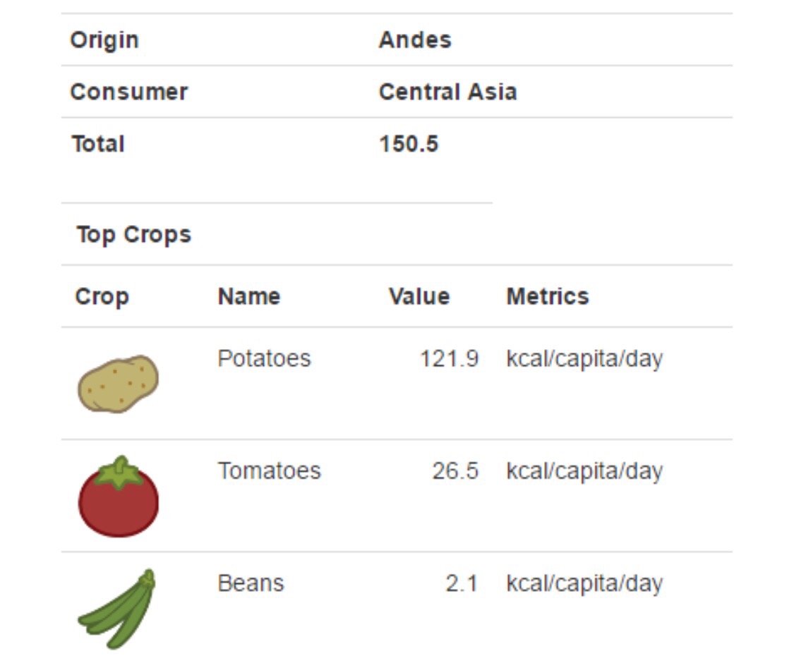
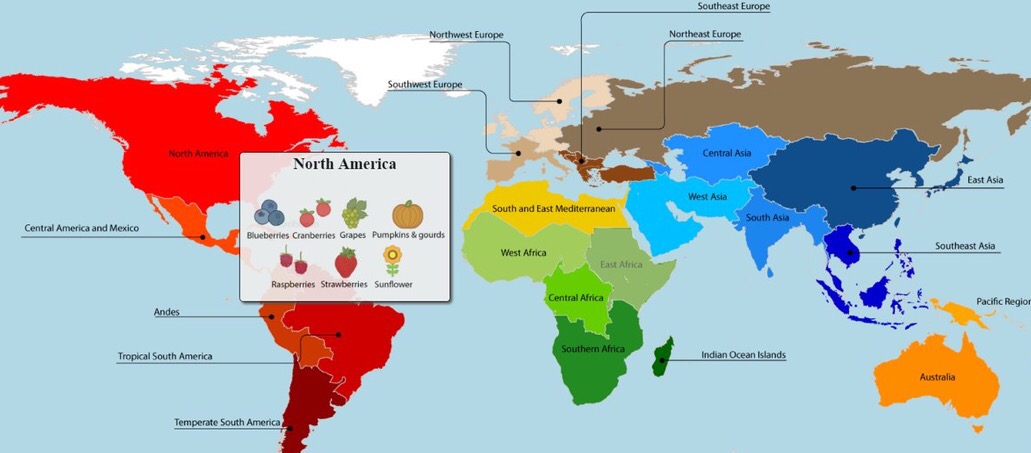
The researchers visualized their results in an interactive map that allows you to see where exactly different food products come from. And some of them might surprise you.
Nothing as American as apple pie, right? Maybe not, because apples originated in Asia and Europe. And while British tennis fans have been eating strawberries and cream since the 19th century, the fruit originated in North and South America.
The numbers affirm what we have long known – that our entire food system is completely global,” the lead researcher told journalists.
You must be logged in to post a comment.