Here’s what 180 years of prices in Sweden tell us about globalization
When you think globalisation began depends on how you define it. Ancient civilizations and medieval cities of course exchanged tools, plants, diseases, and ideas. But most recent discussions of the start of globalisation define it as integration of a market across regions or countries, as measured by the convergence of commodity prices. For example, The Economist (2013) argues there was a world silver market after about 1500.

O’Rourke and Williamson argued already in 2002 that commodity price convergence is indeed the best way to measure the integration of markets that defines globalisation. They note the international trade in luxury goods – such as spices, silk, furs, and gold – from 1500 to 1800. But they suggested that falling transport costs led to a globalisation big bang in the 1820s marked by the integration of markets for necessities like grains and textiles. For the first time, this international integration began to affect how capital and labour were used within domestic economies, and thus also began to be the subject of political debates
A wealth of recent research studies the historical departures from the law of one price: how relative prices across locations were related to distance and whether that effect declined over time.

New research studies price convergence using annual market prices from within Sweden, for 1732–1914, painstakingly collected by Jörberg (1972) and his colleagues (Crucini and Smith 2016). The prices are for 32 towns and 19 commodities: nine agricultural goods (beef, butter, hay, hops, pork, straw, tallow, wheat and wool), two animals (oxen and sheep), one fish (Baltic herring), four building materials (bar iron, log timber, sawn batten, and tar) and three sources of light or heat (charcoal, tallow candles, and wax candles). This large coverage of years, towns, and commodities yields 502,689 relative prices.
Sweden changed currencies several times during the 18th century, and the krona was not introduced until 1803. Thus we cannot graph continuous price series because it is not clear how to splice across currencies. But we can readily calculate a measure of price dispersion: the absolute value of the log, bilateral, relative price. We then relate this measure statistically to (a) the great circle distance between towns, and (b) the year. Imagining the distance on the horizontal axis and price dispersion on the vertical axis, we then estimate the median distance function, which is simply the intercept plus the slope drawn through this scatterplot and evaluated at the median distance. The large number of prices means that this function can be estimated separately for each year pooled across commodities. We do not need to guess the shape of the time trend.
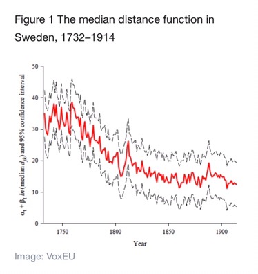
Figure 1 shows the result. The central, red line gives the median distance function and the outer, black lines give its 95% confidence interval. This overall time effect is volatile at the beginning of the sample, but then begins a marked decline after 1760. It falls fastest in the remainder of the 18th century, then continues a more gradual decline – with some volatility – until 1914. A similar pattern appears for almost all individual commodities. Thus the distance function became flatter over time.
To read the entire article, click here: WEF article
Source: World Economic Forum
You must be logged in to post a comment.